Have you ever wondered why you prefer certain colors over others? Or why some colors make you feel happy, while others make you feel uneasy? Today, we'll explore the fascinating world of color psychology and its impact on our daily lives.
Introduction
I decided to write this story after reading the article titled “Why your favourite colour is probably blue?”. To put it briefly, the main reason is that blue is the color we encounter most frequently in the world, followed by green and white. Now, take out your phone and observe the colors of the applications on it. Aren’t they also blue, green, and white? So, what do you think was the first Pantone color ever chosen? It was ‘Cerulean Blue,’ which Pantone identified with ‘the sky’s color on a serene day.
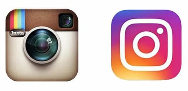
And the researchers found that people never reported ‘‘brown’’ as their overall favorite color yet.. I will explain the “yet” in a moment. But first, let’s look at those logo changes:


The old and new logos of Instragram and Netflix
People don’t like the colors associated with objects that generally elicit negative reactions (e.g. poor browns with negative values, evocative of feces and rotting food). And yet they frequently reported it as a favorite color for carpets and sofas. We can say our color preferences vary across different contexts but why? Several studies in the field of color psychology have provided substantial evidence supporting the hypothesis that the ‘appropriateness’ of a color significantly impacts object color preferences. This insight holds crucial implications for UX/UI designers, as it underscores the importance of selecting colors that align with the context and purpose of a design. In user interface and experience design, the choice of colors goes beyond mere aesthetics; it directly influences how users perceive and interact with a digital product.

Let’s see if you will choose the blue banana. In an experiment involving 48 participants (24 females), they compared participants’ color preferences for Contextless Squares and Imagined Objects. First they were asked to rate how much they liked each color on a scale from ‘‘not at all’’ to ‘‘very much’’. And then they were asked to rate how much they would like each color as the color of the following objects: walls, trim, couches, t-shirts… Trials were blocked by object. This study investigates the reasons why color preferences may vary for different object categories. Specifically, they seek to explain whether people prefer things to have colors that help them perform certain functions and/or whether they prefer it to make people feel a certain way.
People reliably preferred lighter/spacious and relaxing wall colors. Sofa color and t-shirt color preferences were positively related to how well the color concealed dirt. Similarly, in UX/UI design, color choices should align with the intended functions of the interface. For example, using calm, muted tones in a meditation app can help create a tranquil environment conducive to relaxation, while vibrant colors could be used in a fitness application to evoke energy and motivation.

Later in the study, the question becomes how one’s actual experiences with sofas of different colors can be reflected in judgments of sofas of other colors. One possibility is to consider one’s desired experience with the object, as others have suggested. Even if one has never actually seen a couch in red, for example, one might want the couch to blend with its surrounding furniture and walls. It is relevant to UX/UI design in the context of user preferences and expectations. It highlights that users often make judgments and form preferences based on their previous experiences with similar objects. While a “blue banana” may be an amusing notion, it underscores the importance of context in color selection. Designing blue bananas in your digital products probably won’t work. And this is still a bad CTA even though our favorite colour is blue.
Conclusion
In conclusion, color preferences are influenced by a myriad of factors, including personal experiences, cultural background, and the context in which colors are presented. Understanding the psychology of color can help designers create more effective and user-friendly interfaces that resonate with their target audience. By leveraging color psychology, designers can craft digital products that not only look visually appealing but also evoke the desired emotions and behaviors in users. So, the next time you’re choosing a color for your website or app, remember that it’s not just about aesthetics; it’s about creating an experience that resonates with your users on a deeper level. If you want to leverage color pyschology in your branding and user experience design, get in touch with us today!
References
How Is the Pantone Color of the Year Chosen?
Why your favourite colour is probably blue?
Object Color Preferences, Karen B. Schloss, Eli D. Strauss, Stephen E. Palmer, Department of Psychology, University of California, Berkeley, CA 94720–1650, 2012.
